The name
Eunoia
A Greek word for beautiful thinking and a state of wellbeing. It gives the product a name that carries its feeling — calm, considered, warm — and sets it apart from the clinical vocabulary of smart devices.
Aura by Paula — Eunoia
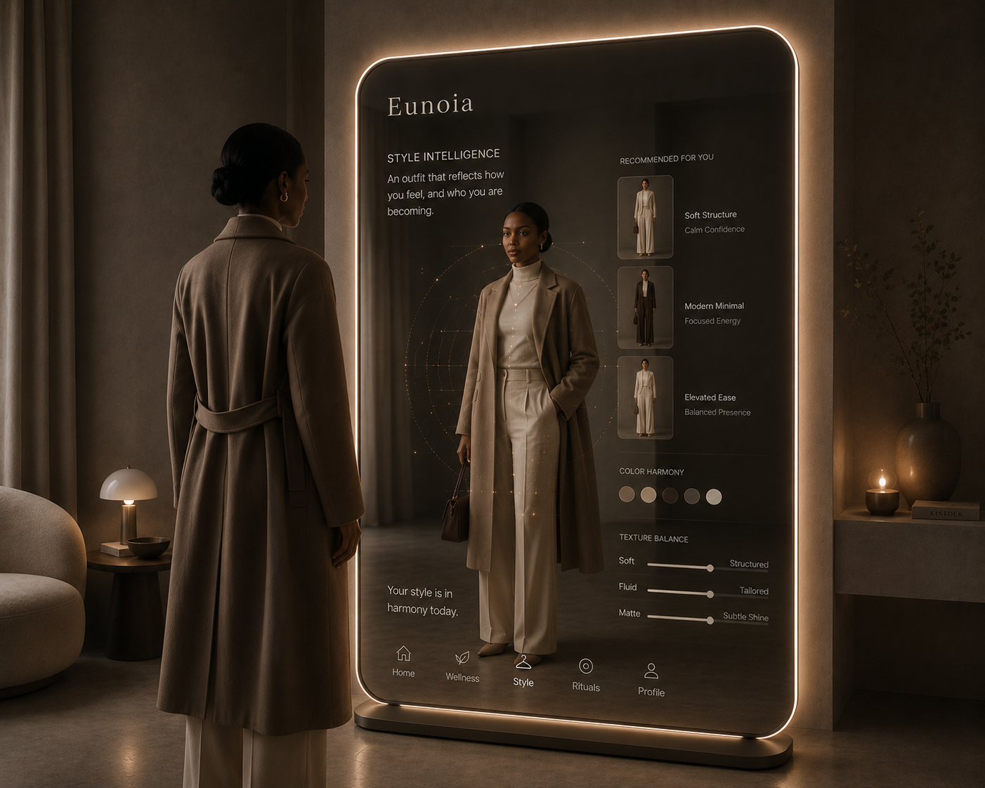
Eunoia is an intelligent mirror. Restraint, legibility and a clear line on control turn an aesthetic recommender into something a person will trust with how they show up. Eunoia surfaces options — you make the call.
The spine
The name
Eunoia
A Greek word for beautiful thinking and a state of wellbeing. It gives the product a name that carries its feeling — calm, considered, warm — and sets it apart from the clinical vocabulary of smart devices.
The positioning line
“This isn’t a productivity tool, it’s a ritual companion.”
The test every other decision runs against. Whenever a screen starts to feel like a task manager, the words are wrong — and the fix usually lives in the copy before it lives anywhere else.
“Eunoia surfaces options, you make the call. Designed to inspire, not automate. The best mornings are still yours to own.”
Four heuristics
The rubric was written before the first screen: four heuristics for aesthetic AI that behaves like a good confidant instead of a good salesperson. Every surface in this flow answers to one of them.
Propose less, and only when there is something worth saying. What you leave off the screen is a decision.
01 Home — one question sets the read. No quiz, no intake form.
Show the read. A person should see why a suggestion appeared and what the system thinks it knows.
03 Style — every look names the feeling it serves.
Leave room to disagree. Changing the model's read is a first-class action, not a buried setting.
04 Decision — Adjust re-reads the mood and proposes again.
Do not design for the metric that hurts the person. Measure movement, not worth. No manufactured urgency.
02 Wellness — progress against your own yesterday, never an ideal.
Fully interactive
The full session, live. Pick a mood and the read follows, from the first look to the last door.
Yes, it is clickable. Pick a mood, shift the read, try a look on, then move through shop, rituals and playlist. Every control responds.
One mood, a few doors
Low fidelity

Content design
Verbs open a door — surfaces, notices, guides — rather than issue commands.
The system stays in the background, described by what it does for you, not how it works inside.
Language borrowed from ritual and rest, not from devices and dashboards.
Trust comes as much from the boundaries you name as the features you promise.
Propose and pause
Writing a voice is one skill. Designing a dialogue that stays in that voice under pressure is another. Every turn ends with one small, optional question that hands the floor back: one offer, one question, the person’s move.
The happy path — a morning check-in
Eunoia answers to the feeling before the task. That rhythm — propose and pause — is how “you make the call” survives an actual conversation instead of only a screen.
When Eunoia gets it wrong
Every miss is designed as a repair, not a failure. No apology to manage, no dead end — because a dead end is where trust leaks out of a product.
Before / after
The human-in-the-loop line
First draft
Eunoia picks the perfect outfit for you.
Published
Eunoia surfaces options, you make the call. Designed to inspire, not automate.
Picking for you hands over the most personal decision — exactly the part people want to keep. Moving the choice back turned a quiet threat into a real offer.
The recommendation screen
First draft
One auto-selected outfit and a single button: Wear this.
Published
Three looks, each naming the feeling it serves, each read adjustable.
Wear this was doing the confident thing the wrong way — making the choice instead of making the case. The system went from picking for you to thinking out loud with you.
The first screen
First draft
A style quiz that asked who you are before Eunoia would say anything.
Published
One question — how you want to feel — answered in a single tap.
The quiz broke Restraint on the very first screen. Asking how someone wants to feel was the moment Eunoia started to feel like itself.
The waitlist call to action
First draft
Join the waitlist
Published
Get early access
A waitlist describes a queue you wait in. Early access describes something you receive — the same button moved from a task into an invitation.
Design language
The surface stays smoked, low-lit glass so the brightest thing in the frame is always the reflection, never the UI. Warm gold is the only accent, used as light rather than decoration. Type recedes, rules are hairline, and nothing performs intelligence at you.
Smoked glass
#2A2117
Warm light
#DFCDBC
Gold glow
#C99E60
Architecture
One input — mood — and a short set of doors behind it. The mood is the key that decides what each door surfaces, so Style feels different on a Calm evening than on a Social one. Navigation stays flat and the surfaces bounded on purpose.
Fraunces
Instrument Sans
Wordmark · Interface
Also from Aura by Paula
The same content-design instincts behind Eunoia, applied to fashion. Each of these is built as a system with its own taxonomy, voice, and decision rules, not a set of one-off pages.
A 19-look styling editorial built as a content system: a fixed four-chapter taxonomy, a consistent house voice, and a rule set every look has to answer to.
Read the issue →A personalized client deliverable structured as a decision system: 23 pieces mapped to budget, occasion, and sourcing, with rule-based head-to-toe pairings.
View the guide →